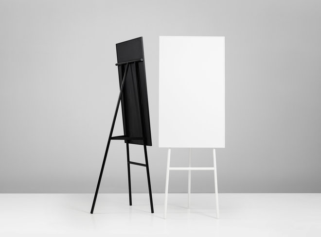
While the technical progress increases constantly, flip charts fall more and more into oblivion. But they are more than just relics. Flip charts are still the most effective presentation media of all.
Usually, the simplest visuals are the best because you always have to remember that your visual aids should just enhance your presentation and that’s what flip charts do in the easiest way.
Often when high-tech computer generated presentations were used, they become the presentation and not the speaker. And that’s very dangerous for a successful presentation. It’s important to remember that you should be the biggest part of your lecture and not your visual aids.
However flip charts offer more advantages. They are low tech, reliable and don’t require any special skills to use them.

So here are some tips for using flip charts more effectively:
The first thing you should do is the planning of how your flip chart pages should look. Usually, one idea per page works the best, so don’t try to fit lots of ideas and diagrams onto one page. When you prepare your pages, it is advisable to first design them on paper before drawing them on the actual flip chart page. Be careful when writing words on the flipchart, make the letters large and clear enough so people at the back can read them. Moreover, not everyone has the gift of really neat handwriting, so write your text lightly in pencil first before using the actual flip chart markers.
The second thing that makes your flip chart presentable is using colours, diagrams and pictures. Graphics and pictures allow you to communicate your message more effectively and make difficult topics clearer to the audience. You should draw some, even if you are not an artist. It’s easy – you could do it the same way like the writing – just sketch them in pencil beforehand. You don’t have to do it freehand style.
Using one dark colour and one light colour works best. The reason for using dark colours like black or blue is that they maximise visibility all the way to the back of the room and can be seen from a large distance. Light colours like orange or red can be used for highlighting your flip chart content, for example, circling or underlining. When using multiple colours, try to limit the variety to two or three colours per chart page.
The third and last thing is to be prepared for your own presentation. Before you are going to hold your lecture you should check the position of your flip chart to maximise visibility for your audience. Make sure every word you wrote on the flip chart can be read in the back row of the room. Moreover, check that all of your markers write well and that you have the expected number of flip chart pages. Another tip is to use pads with perforations at the top. They allow easier removal of the sheets and don’t cause a struggle to tear them off.


